Scatter Plot
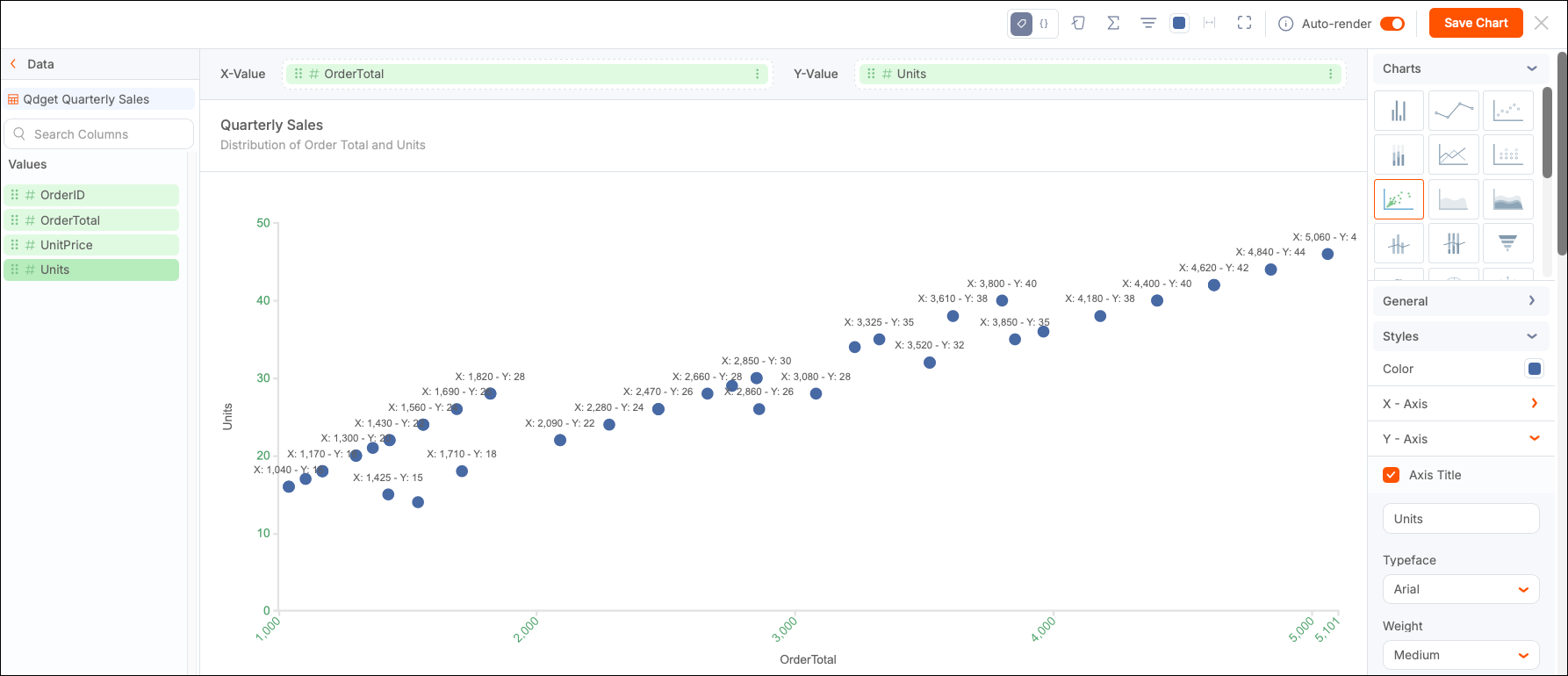
Use a Scatter Plot chart to visualize the relationship between two numerical variables by plotting individual data points on a two-dimensional grid.
Usage
This XY chart provides an intuitive and flexible way to explore relationships between numeric variables, focusing on raw data visualization without aggregation. The visualization helps identify correlations, trends, clusters, and outliers within the data, making it a valuable tool for exploratory data analysis.
Create a Scatter Plot
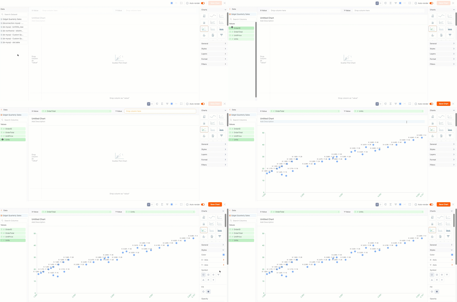
Use a Scatter Plot to present a distribution of numeric values. To create a single-series Scatter Plot, drag and drop a value from from the Data Panel onto the corresponding shelf or the canvas.
The following use case shows the order distribution (Units) across a set of orders (OrderTotal).
Style a Scatter Plot
Use the Configuration Panel in Chart Builder to style different aspects of your scatter plot.
General
The General section is available for all chart types. The options vary depending on the chart selected.
Styles
Use the Styles section to control visual elements such as colors and labels. Scatter plots support the following specific style options.
-
Color - Change the color of the symbol displayed on the plot.
-
X-Axis
- Axis Title - Select to add or edit a title in the field provided.
- Typeface - Select the label typeface.
- Weight - Select the label font weight.
- Size - Select the label font size.
- Font Color - Select the label font color.
- Value Labels - Determines whether the value labels are displayed.
-
Y-Axis
- Axis Title - Select to add or edit a title in the field provided.
- Typeface - Select the label typeface.
- Weight - Select the label font weight.
- Size - Select the label font size.
- Font Color - Select the label font color.
- Value Labels - Determines whether the value labels are displayed.
-
Symbol - Select the symbol used to plot values on the scatter plot. Default is circle.
-
Fill - Select Filled (default) or Hollow.
-
Opacity - Adjust the transparency level of the chart elements.
-
Display Outliers - Show data points that fall outside statistical norms.
-
Outliers Color - Select a different color (optional) to highlight values that fall outside of statistical norms.
-
Data Labels - Select (default) to display labels for each data point.
-
Borders - Select to create a border around each label.
-
Offset - Adjust the position of elements in the layout using Percentage or Pixels. You can apply the offset from the Left or Bottom of the chart.
Layer
Add a Trend Line to your chart to allow users to visually compare the data against some set trend or reference value.
Format
You can apply conditional formatting to Scatter Plot Charts.
Filters
You can also add filters to your data by expanding the Filters section in the configuration panel or selecting Filters in the toolbar above the canvas. Filters that are created in the Chart Builder are hidden from end users. You cannot edit or interact with these filters in view mode.